Role
Product Designer
Platforms
iOS, Android

e-Taxfiller is a mobile app that focuses on a curated set of the most popular IRS tax forms. Instead of searching the web and downloading random PDFs, users can open the app, browse simple categories or use search, pick the form they need and choose the correct revision.
All forms come pre-built with fields and are prepared for filling, so people don’t have to struggle with raw PDFs. They can simply go through the form field by field and simply enter their data.
Under the hood, the app reuses the same editor engine as the pdfFiller mobile product. Forms open directly inside e-Taxfiller in a field-by-field filling mode, with an option to switch to a more flexible annotation mode when needed — for example, to adjust details or add a signature.
I was the sole designer on the project and worked end to end on the experience: from how people discover and select forms to how they fill them and what happens after they are done, in close collaboration with a PM and the engineering team.
In the main pdfFiller product we already offered a huge catalogue of forms of many types, including a large set of IRS and other tax-related documents. Over the years, analytics and our own experience made it clear which tax forms were used the most and which ones people kept coming back to every season.
At the same time, we saw that many people who were not yet our customers — but were very likely to be good potential users — were searching for these same tax forms directly in the mobile app stores. They weren’t looking for a complex document tool, they just wanted a quick way to get the right IRS form on their phone and fill it.
Our hypothesis was that a focused mobile app with a curated list of the most popular IRS forms — always up to date and already prepared with fillable fields — could make this job much faster and also act as a lightweight first step into our ecosystem. After completing a form, people could either send or print it right away, with a clear path to more advanced workflows in our other products when they needed them.
The main idea was to keep the flow simple: pick the form you need, fill it in, and then decide what to do next.
A few principles guided the design:
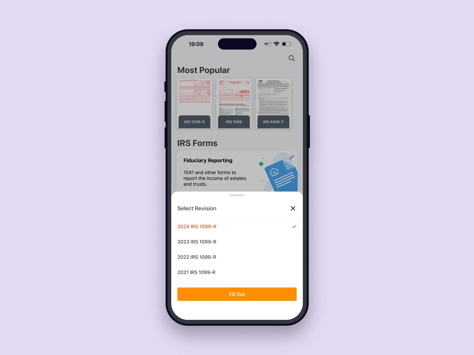
Quick start. The home screen shows a short list of the most used IRS forms, grouped into a few clear categories with search on top. The idea is to make the app feel like a quick shortcut to “the form I need right now”.
Clear way to pick the right revision After choosing a form, users can select the exact revision they need, so it’s easy to be sure they’re filling the right version.
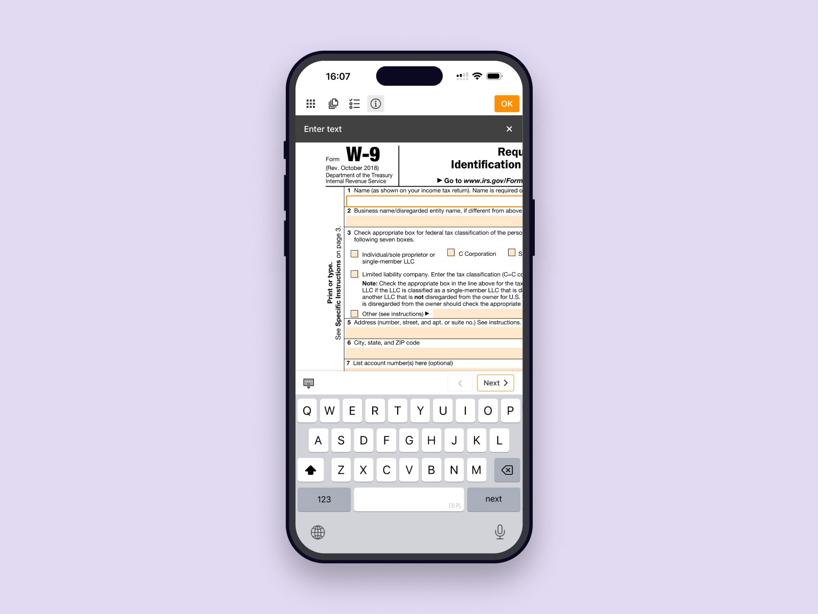
Simple way to fill the form. Forms start in a guided field-by-field mode, so users can quickly go through all fields and fill in the form. If they need more flexibility, they can switch to an annotation mode to adjust details.
Clear next best actions after filling. Once the form is complete, an action sheet presents a set of options: send, share, printw, or continue in our other products via Sign (signNow) or Edit as PDF (pdfFiller) for more advanced workflows.


Based on product analytics and event tracking, around 75% of started forms were completed, which was a good result, and about 23% of users went further into the ecosystem by using the Sign or Edit as PDF actions and continuing in signNow or pdfFiller.
The app held a rating of around 4.8★ in the stores and received positive feedback about how easy it was to find and complete the right form. Usage naturally spiked during the tax season, which matched the core use case and showed that people saw it as a handy tool when they needed to deal with tax paperwork.
Reusing existing components is a powerful way to ship products quickly and deliver real value. We didn’t need a brand-new editor, we needed the right flow and framing around it.
Single-purpose apps can work well as entry points into a larger ecosystem when the next best actions are clear. In e-Taxfiller, actions like Sign and Edit as PDF acted as natural follow-ups after working with a form.
Highly focused products are often more effective when they are designed to do one thing extremely well. In our case, limiting the scope to the most common IRS forms made the experience faster and clearer than a generic “all forms” product: people could simply find the right form, fill it on mobile and move on.